【Flutter 3-1】Flutter手把手教程UI布局和Widget——底部导航栏BottomNavigationBar使用
2021/1/31 8:07:34

本文主要是介绍【Flutter 3-1】Flutter手把手教程UI布局和Widget——底部导航栏BottomNavigationBar使用,对大家解决编程问题具有一定的参考价值,需要的程序猿们随着小编来一起学习吧!
作者 | 弗拉德
来源 | 弗拉德
BottomNavigationBar
BottomNavigationBar 和 BottomNavigationBarItem 配合来共同展示Flutter里面的底部状态栏,底部状态栏是在移动端很重要的控件。
先看一下 BottomNavigationBar构造方法
BottomNavigationBar({

// key

Key key,

/// BottomNavigationBarItem 数组

@required  this.items,

/// 点击事件方法

this.onTap,

/// 当前选中的 元素下标

this.currentIndex = 0,

/// 底部导航栏的Z坐标

this.elevation,

/// 默认是 BottomNavigationBarType.shifting 一般我们使用 BottomNavigationBarType.fixed

this.type,

/// 选中项目颜色的值

Color fixedColor,

/// 背景颜色

this.backgroundColor,

/// BottomNavigationBarItem图标的大小

this.iconSize = 24.0,

/// 选中时图标和文字的颜色

Color selectedItemColor,

/// 未选中时图标和文字的颜色

this.unselectedItemColor,

// 选中时的子Item的样式

this.selectedIconTheme,

/// 未选中时的子Item的样式

this.unselectedIconTheme,

// 选中时字体大小

this.selectedFontSize = 14.0,

/// 未选中时的字体大小

this.unselectedFontSize = 12.0,

/// 选中的时候的字体样式

this.selectedLabelStyle,

/// 未选中时的字体样式

this.unselectedLabelStyle,

/// 是否为未选择的BottomNavigationBarItem显示标签

this.showSelectedLabels = true,

//// 是否为选定的BottomNavigationBarItem显示标签

this.showUnselectedLabels,

/// pc端或web端使用

this.mouseCursor,

})
我们来做一个点击底部状态栏按钮切换颜色的Demo
class  _BottomNavigationBarDemoPageState

extends  State<BottomNavigationBarDemoPage> {

int selectedIndex = 0;

List<Container> containerList = [

Container(

color: Colors.red,

),

Container(

color: Colors.blue,

),

Container(

color: Colors.yellow,

),

Container(

color: Colors.green,

)

];

@override

Widget  build(BuildContext context) {

return  Scaffold(

appBar: AppBar(

centerTitle: true,

title: Text("BottomNavigationBarDemo"),

backgroundColor: Colors.blue,

),

body: containerList[selectedIndex],

bottomNavigationBar: BottomNavigationBar(

/// 这个很重要

type: BottomNavigationBarType.fixed,

currentIndex: selectedIndex,

onTap: (index) {

setState(() {

selectedIndex = index;

});

},

items: <BottomNavigationBarItem>[

BottomNavigationBarItem(

title: Text('F1'),

icon: Icon(Icons.home),

),

BottomNavigationBarItem(

title: Text('F2'),

icon: Icon(Icons.book),

),

BottomNavigationBarItem(

title: Text('F3'),

icon: Icon(Icons.school),

),

BottomNavigationBarItem(

title: Text('F4'),

icon: Icon(Icons.perm_identity),

),

],

),

);

}

}
-
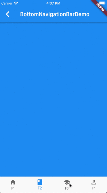
Scaffold接收一个BottomNavigationBar作为bottomNavigationBar的参数,然后BottomNavigationBar接收一个items的数组,这个数组里面传入了4个BottomNavigationBarItem对象分别命名为F1、F2、F3、F4 -
type参数传入的是BottomNavigationBarType.fixed,默认是BottomNavigationBarType.shifting,默认的效果是 只有在选中BottomNavigationBarItem时才会显示文字。设置成BottomNavigationBarType.fixed非选中状态下也会显示文字和图标 -
onTap实现的是一个方法,参数是被点击的当前BottomNavigationBarItem的下标,在这里被点击后调用setState来刷新页面的颜色
效果如下:
日常开发中以上效果基本能满足大多数需求
如果想要自定义下面Icon的样式,可以使用 [BottomAppBar] material.io/components/app-bars-bottom/android#anatomy-and-key-properties
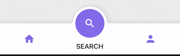
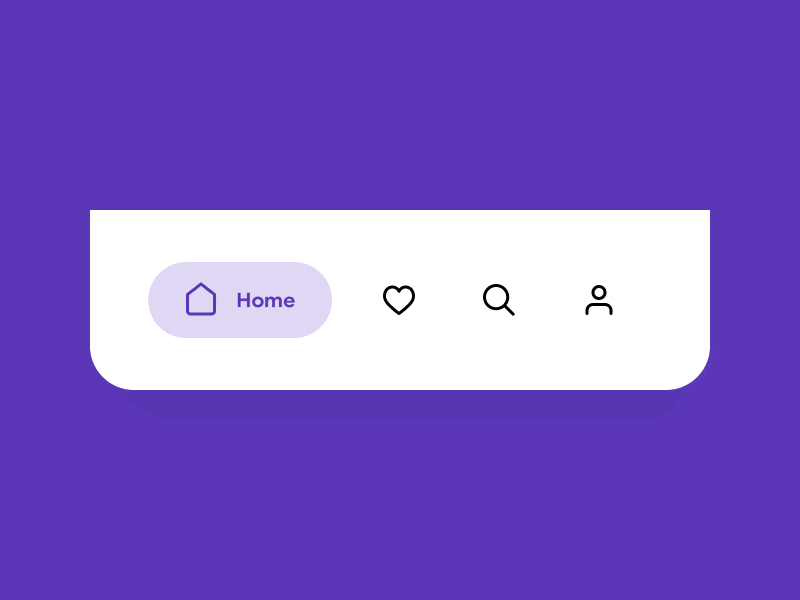
这里也介绍两个不错的库
- tab_bar_animation
链接: github.com/tunitowen/tab_bar_animation
效果如下:
- simpleanimations
链接:github.com/TechieBlossom/simpleanimations
效果如下:
想体验以上的示例的运行效果,可以到[我的Github仓库] github.com/Johnson8888/learn_flutter 项目flutter_app->lib->routes->bottom_navigation_page.dart查看,并且可以下载下来运行并体验。
这篇关于【Flutter 3-1】Flutter手把手教程UI布局和Widget——底部导航栏BottomNavigationBar使用的文章就介绍到这儿,希望我们推荐的文章对大家有所帮助,也希望大家多多支持为之网!
- 2024-07-04TiDB 资源管控的对撞测试以及最佳实践架构
- 2024-07-03万字长文聊聊Web3的组成架构
- 2024-07-02springboot项目无法注册到nacos-icode9专业技术文章分享
- 2024-06-26结对编程到底难不难?答案在这里
- 2024-06-19《2023版Java工程师》课程升级公告
- 2024-06-15matplotlib作图不显示3D图,怎么办?
- 2024-06-1503-Loki 日志监控
- 2024-06-1504-让LLM理解知识 -Prompt
- 2024-06-05做软件测试需要懂代码吗?
- 2024-06-0514-ShardingSphere的分布式主键实现


